The future of checkout
The problem
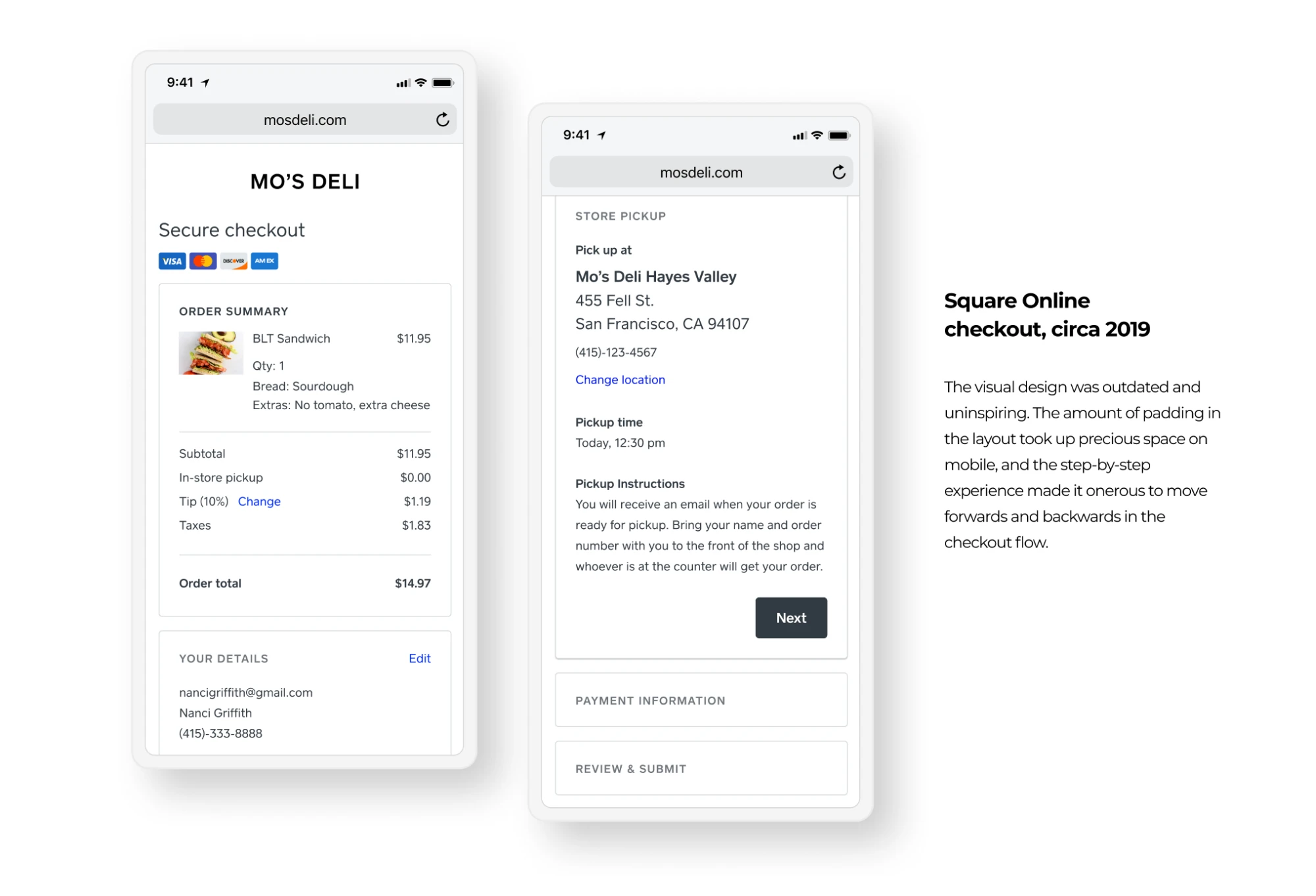
By the end of 2019, Square Online’s checkout was overstuffed and muddled, both experientially and in code. An overhaul was overdue.
The opportunity
Checkout is the most fundamental part of an online store. If we were redesigning something this important, we wanted to rebuild it from the ground up.
We wanted a best-in-class checkout that matched our longer-term vision: online checkout as a flexible, scalable platform.
Design sprint
We kicked off with a cross-functional design sprint across E-commerce design, engineering, and product—questioning even the things we assumed were fundamental.
From the design sprint, we outlined the following principles:
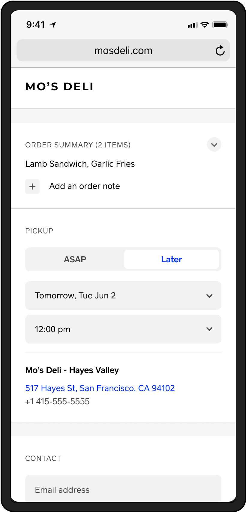
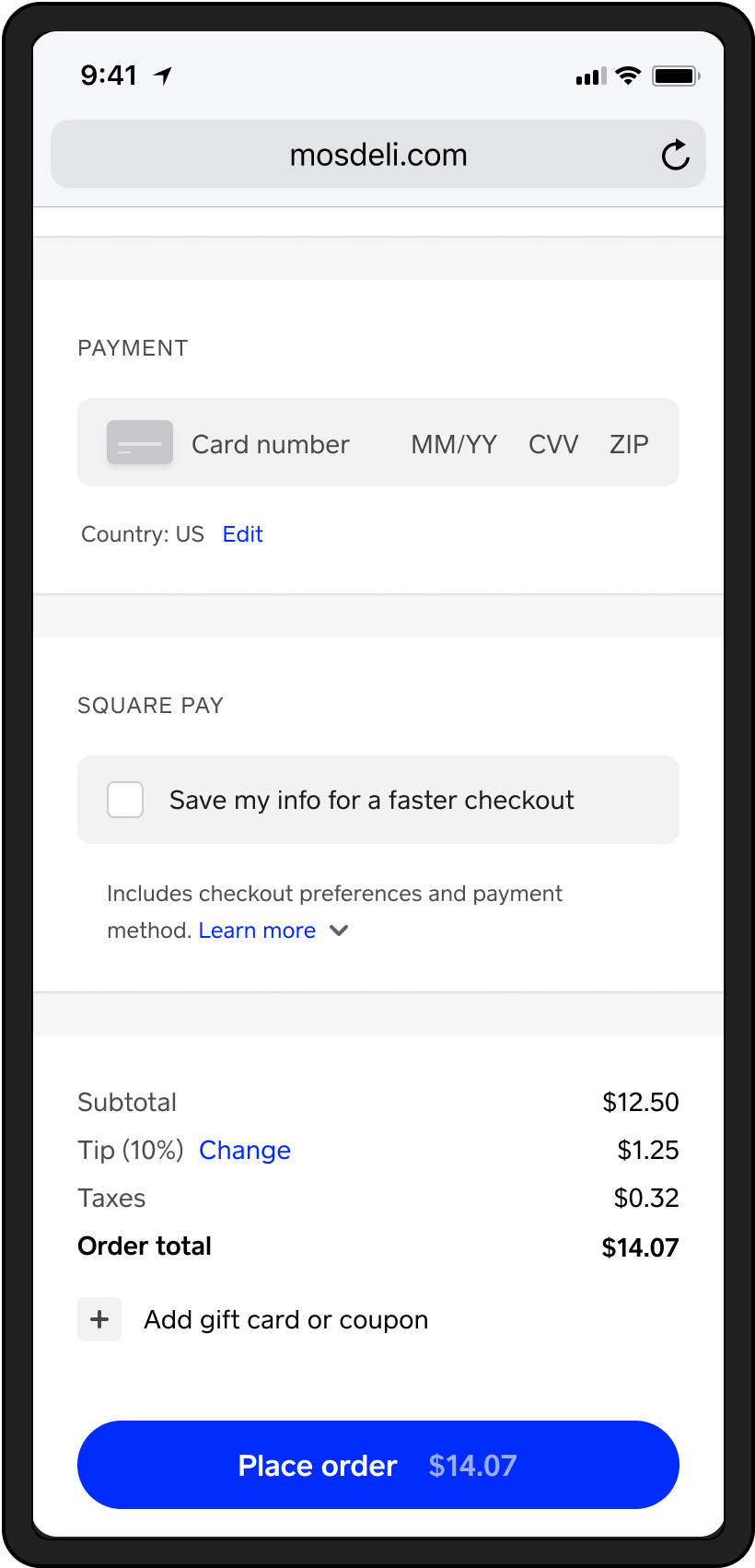
- Prioritize mobile. About 80% of transactions came from mobile, so the mobile experience would make or break checkout.
- Reduce friction, so purchasing could happen quickly and seamlessly.
- Make it scalable and responsive across verticals and use cases, even as functionality expanded.
Design explorations
With principles defined, the head of design for E-commerce, the Site Design lead, and I began exploring.
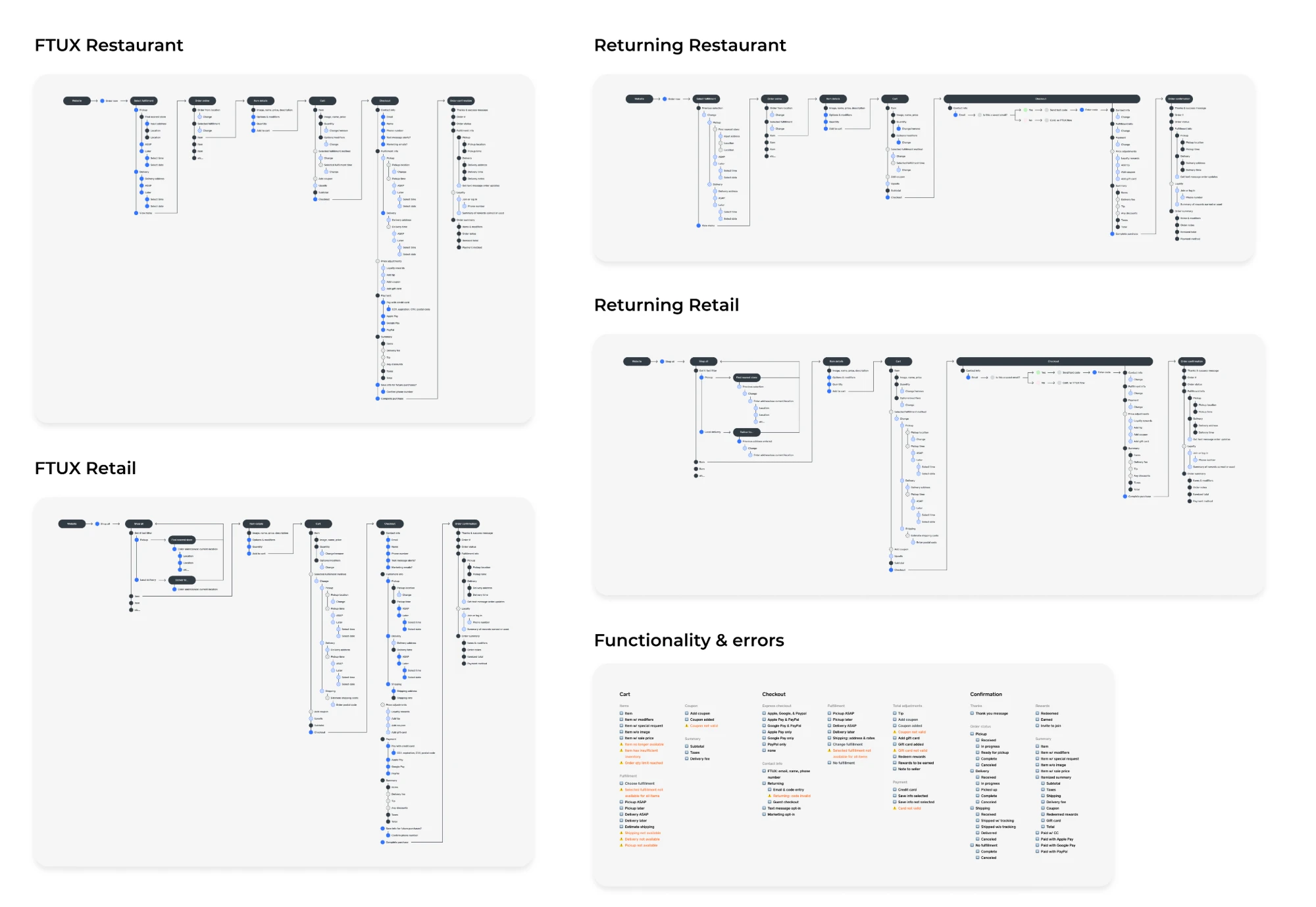
I defined the end-to-end requirements across first-time and returning buyers, and retail and restaurant use cases, and refined the other designers’ proposed patterns to keep the experience cohesive.
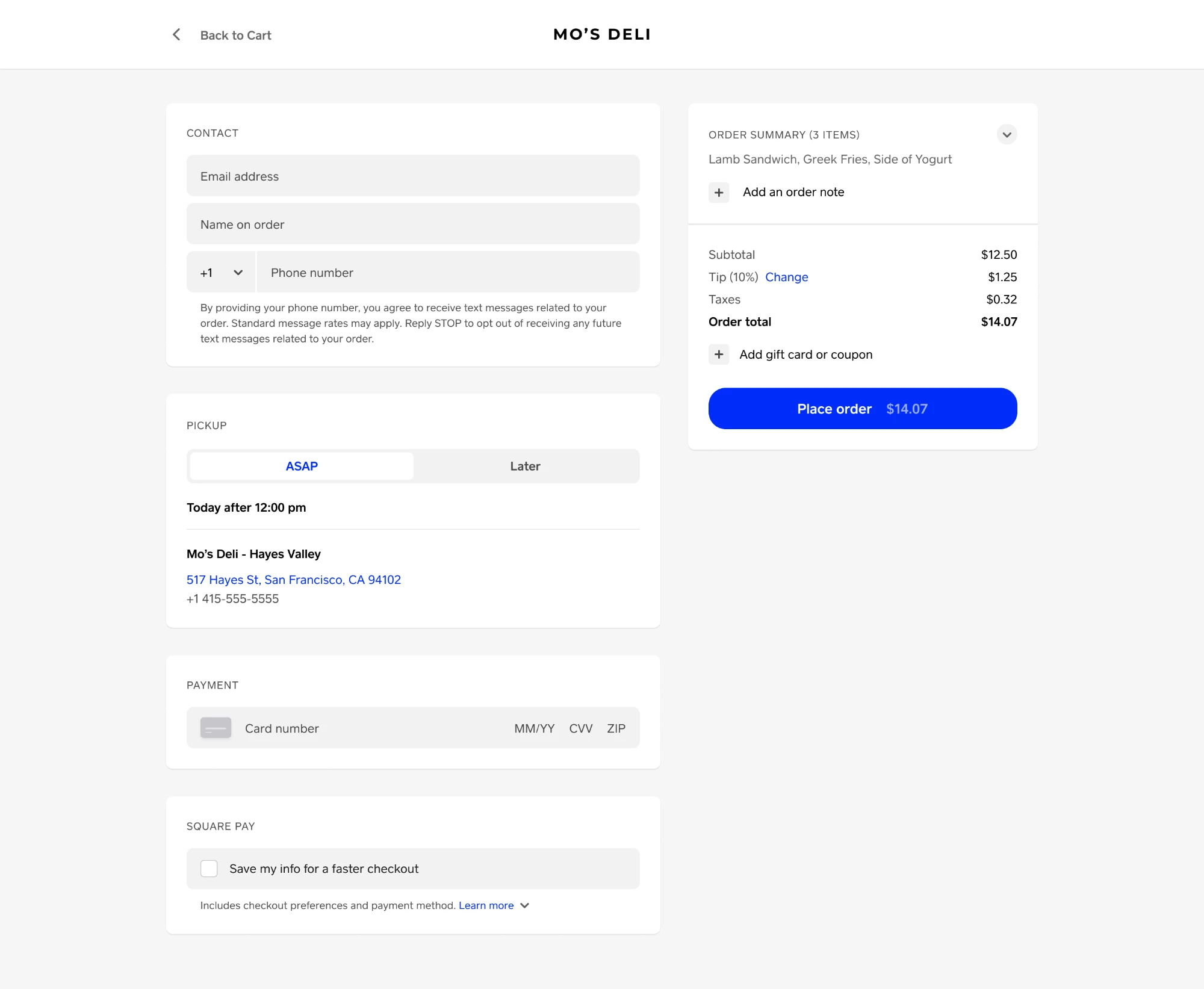
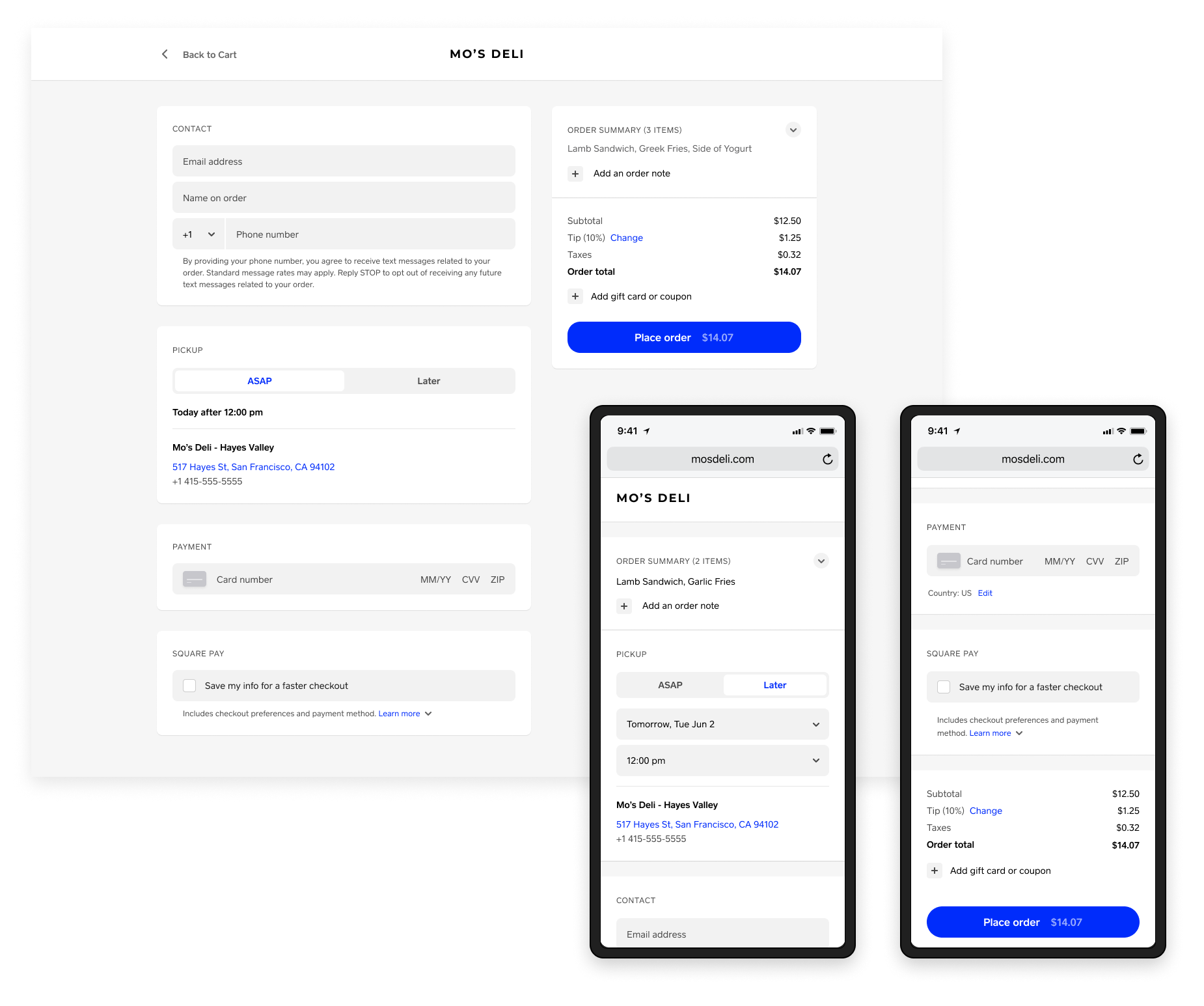
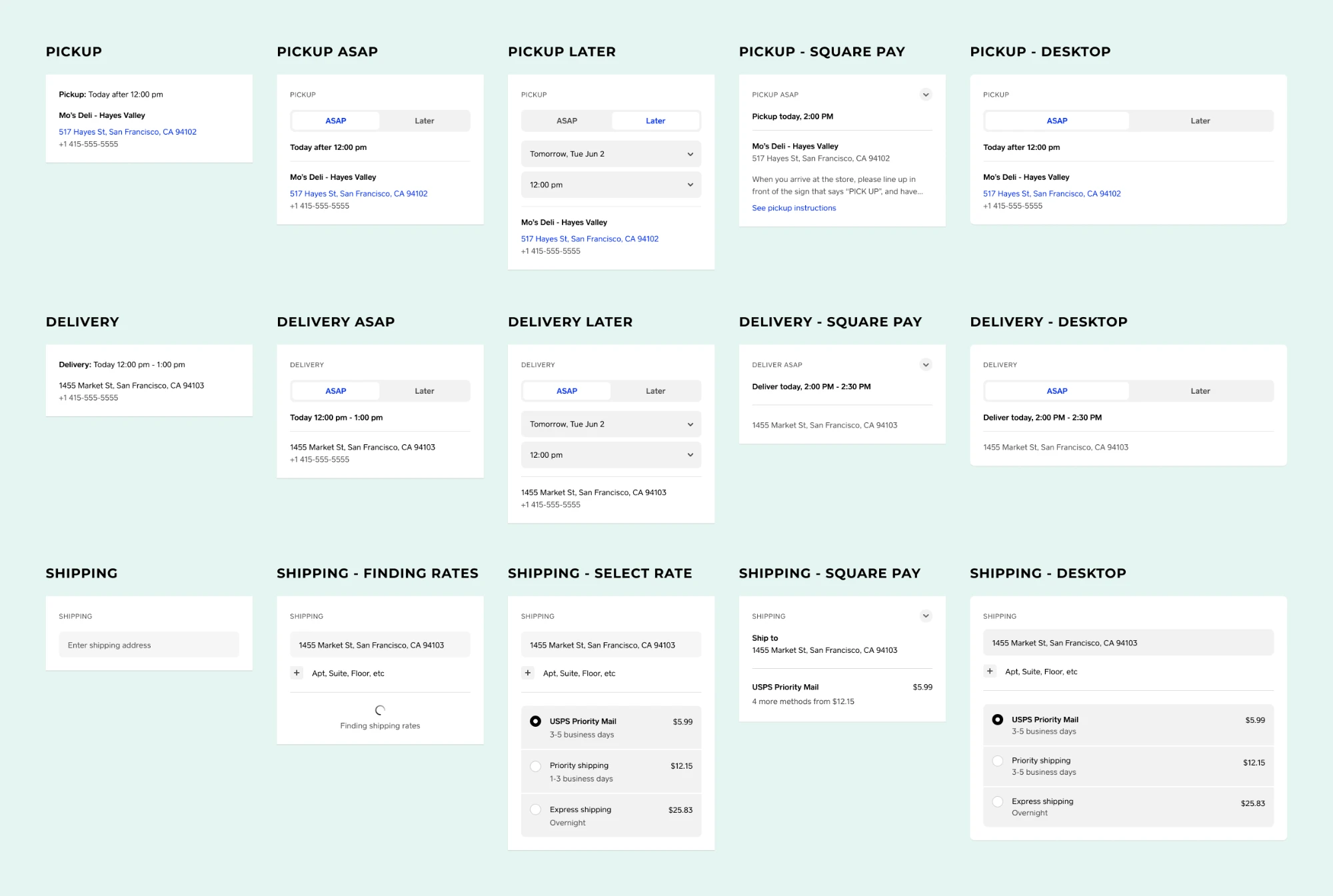
The final direction was restrained, responsive, and modular—sections could be hidden, rearranged, or expanded depending on the seller and order.
We cut the number of form fields and introduced a single-page experience, substantially reducing taps and clicks.
Collaboration with engineering
While design explored freely in Figma, engineering structured their approach to building a brand-new platform.
I stayed close to these discussions and collaborated on defining an approach that kept the user experience front and center. This was paramount, because any disruption to existing sellers risked the loss of sales.
Build & launch & iterate
Once engineering and design aligned, I worked with analytics to define tracking that could accurately judge the new experience’s performance.
We launched each major piece as an A/B test, since any sales loss was unacceptable—a wise call, since our first release, to 10% of US users, showed a small conversion dip.
Aiming for parity with the control, we tested hypotheses and visual tweaks, isolated bugs, and successfully narrowed the gap in conversions.
During this time, E-commerce reorganized and hired more designers, and the project moved to another designer.